UX · Events · 2013
Easytag
Onsite event badges, printed in seconds. Cut entrance-queue wait by a third, and taught me what design thinking actually means.
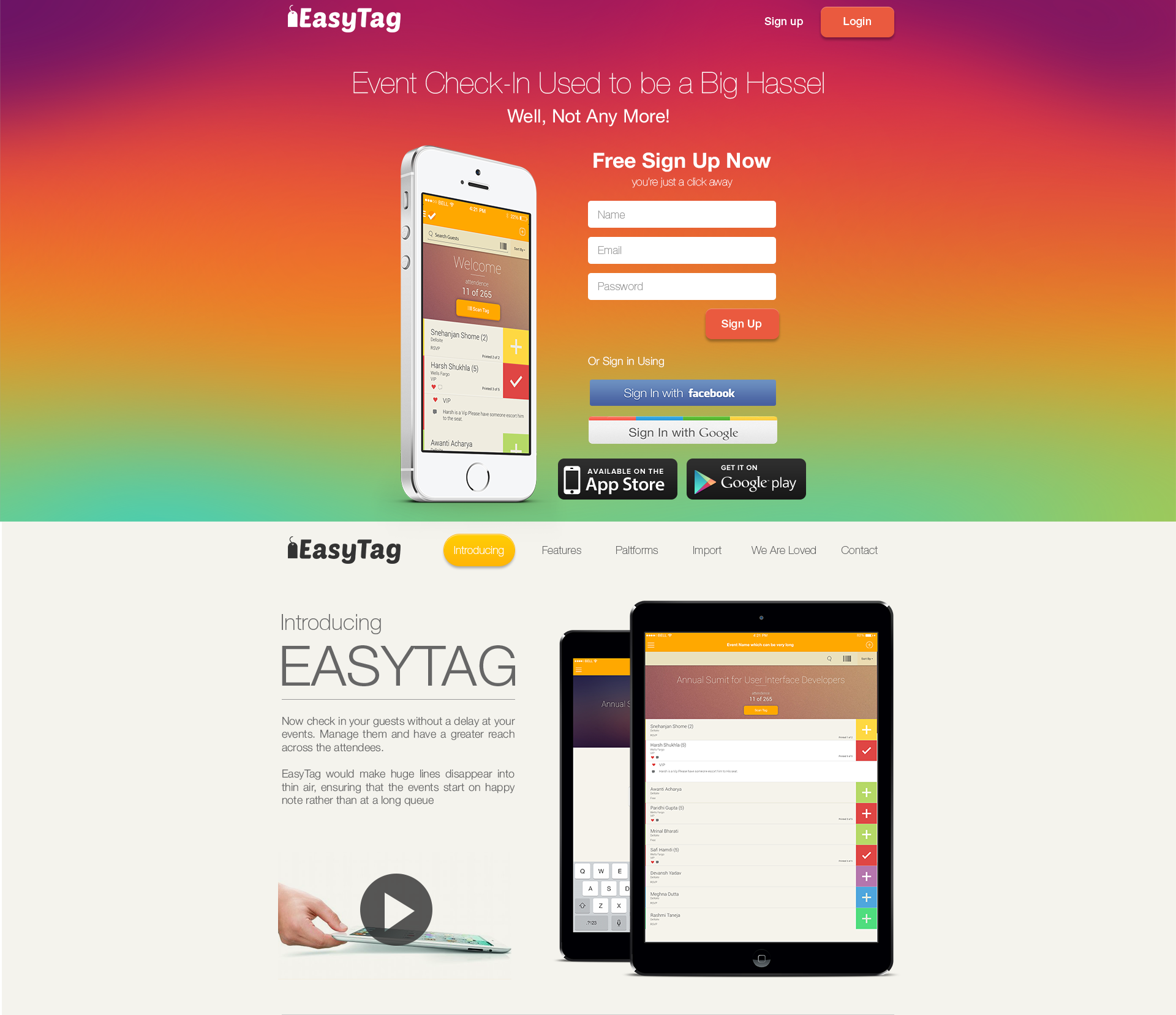
Event onsite badge printing, 2013.
Easytag is a simple onsite event-badge printing solution that works in both manned and kiosk modes. This has been known to reduce waiting time at the entry stalls by 30%, and event staffers prefer it to sorting and handing out pre-printed badges.
This was my first real design project that executed. To this day it remains very special to me. This is the project that taught me the basics of design thinking, the part that actually means sit with the problem for longer than feels necessary, not the part on the conference slides.
Why it mattered
Pre-Easytag, event registration was three things at once: a long table, a wall of pre-printed badges sorted alphabetically by surname, and four polo-shirted volunteers reading those badges aloud. It worked. It worked slowly. The bottleneck wasn’t the printing. The bottleneck was the human in the middle.
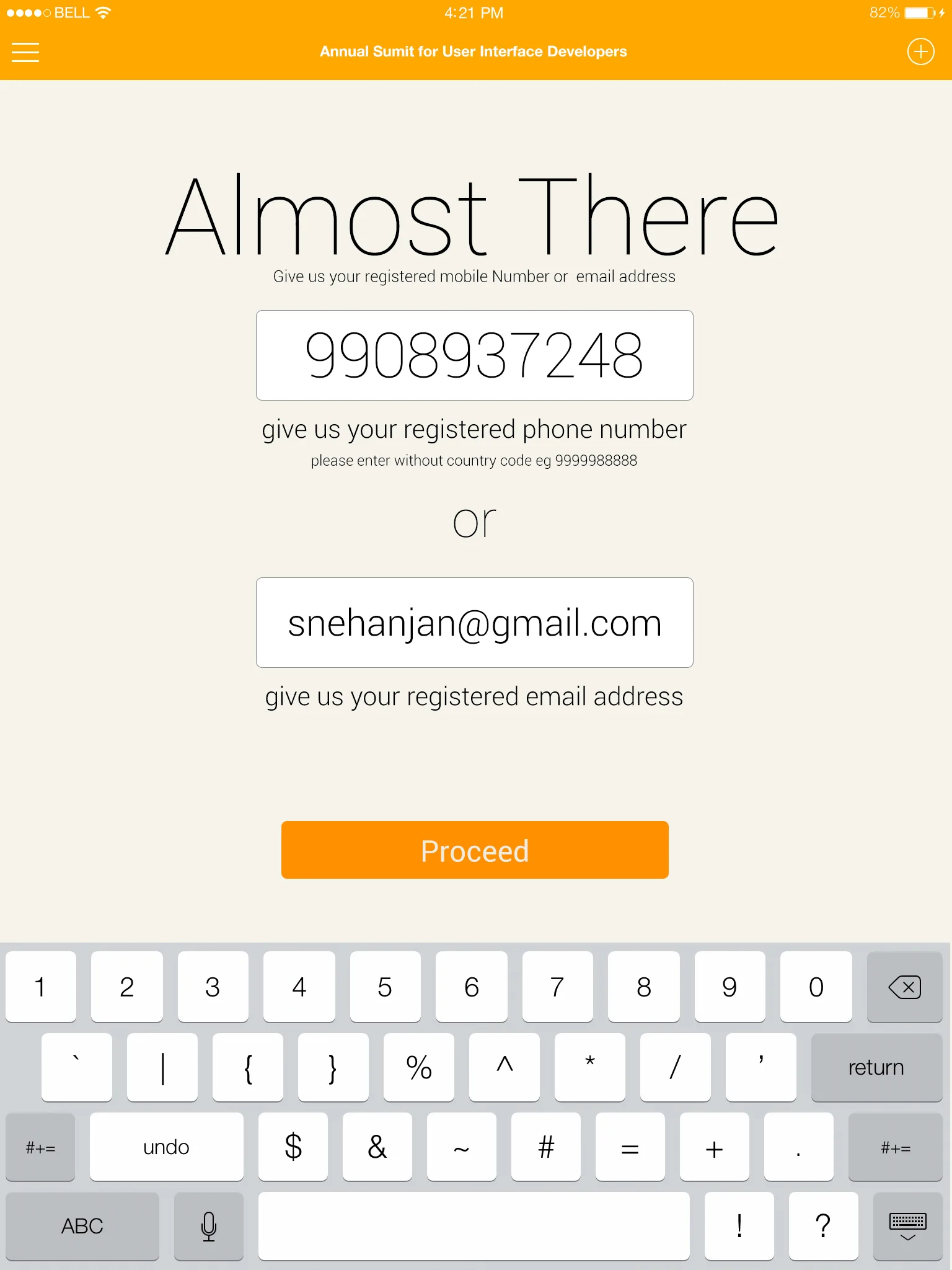
Easytag replaced the table with a kiosk that recognised the attendee (phone or email), pulled the correct profile, and printed the badge on the spot. About as long as it takes to read a notification.
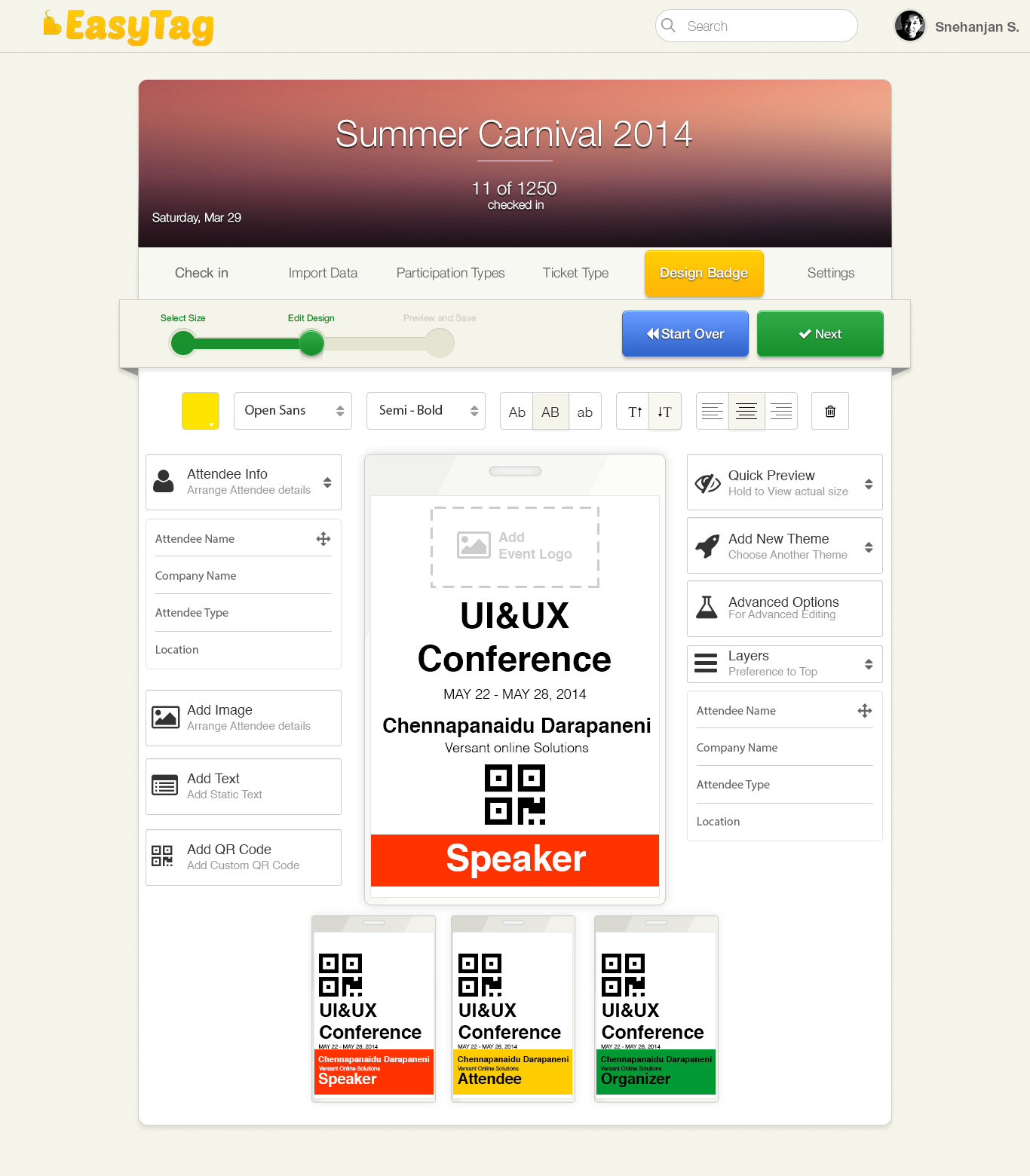
The badge designer
The other half of Easytag was a designer tool for event organisers. Categories on the left (speaker, attendee, press, volunteer), a live preview in the middle, a single export the kiosks consumed. The organiser uploaded a list, configured a template, and Easytag handled the rest.
Two modes, one design
Kiosk mode. Attendee walks up, taps in their phone number or email, the system finds them, the printer warms up, the badge slides out. No staff required.
Manned-booth mode. Same flow, with a staff member running the iPad. Used at events where the on-arrival mix needed a human present (corporate, regulated, or just nervous).
What I learned from it
A few things from this project still come up in every kiosk-shaped problem I see now:
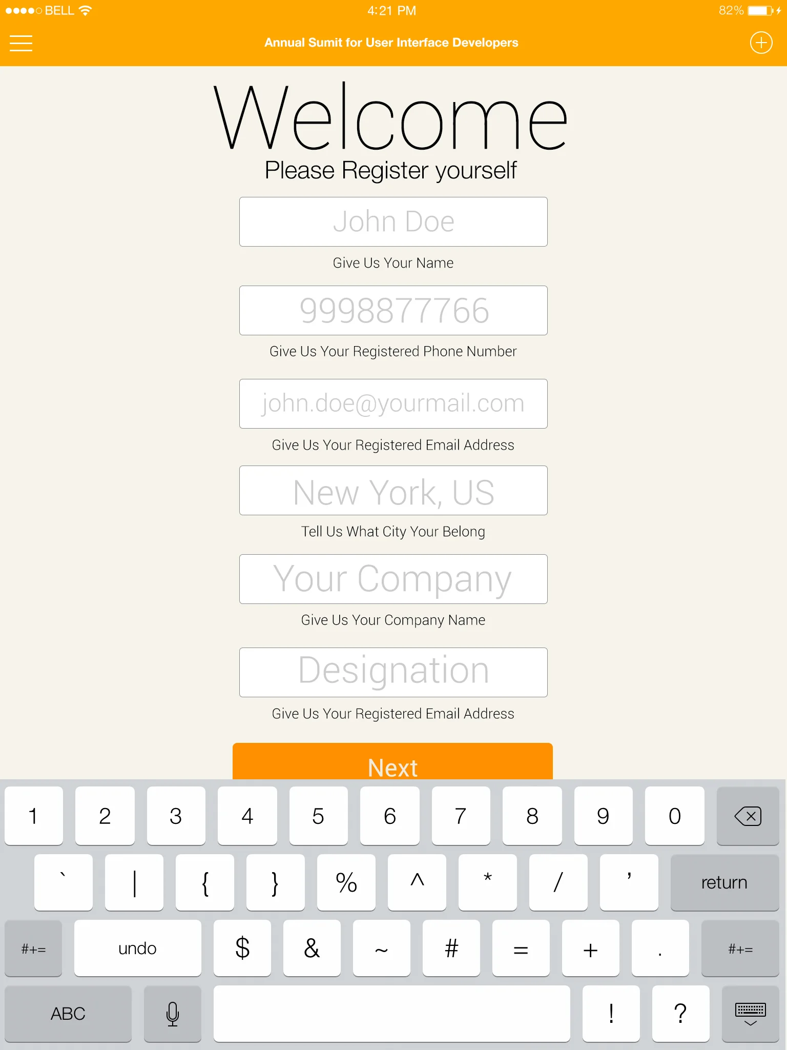
- The error states matter more than the happy path. People typing their own name into a kiosk get it wrong more often than you’d think. The “no record found” flow was where the design either earned or lost the user’s patience.
- The walk-up moment is the whole product. Everything after the first tap is just plumbing. Get the first three seconds right and the rest is forgiving.
- 30% is a real number. Wait time at events feels longer than the clock says. Cutting a third off the average meant cutting most of the irritation.
This is the project that taught me what design thinking meant before it had become a tagline. It also taught me that the most exciting product moment of any event isn’t the speakers. It’s the few minutes when everyone arrives, and the entrance either works or doesn’t. That moment, and the long table that used to handle it, made the whole career interesting.